By this time next year, Doctor Who will have a new actor in the title role, possibly a new companion (if current rumours are to be believed), and certainly a new showrunner in the shape of Chris Chibnall, just as soon as he’s finished clearing up Broadchurch.
Another major change is likely to happen once Season 11 kicks in, although it’s not one that has been chatted about in any great detail as yet – a new title sequence.
Before we speculate on what that will look like, here’s a run down of some of the greatest variations on one of the most iconic opening title sequences in television history…
The First Doctor (1963)
Brilliantly creepy and sinister – no musical instruments were harmed in the making of this sequence – all the foundations for the next fifty-plus years are laid here.
There’s no face of the Doctor here, but it was pleasing to see a these opening credits return in the fiftieth anniversary story ‘The Day of the Doctor’. This version of the credits remained in place for Patrick Troughton’s first four stories.
The Second Doctor (1967)
It might seem like stating the obvious to say that the credits of the Second Doctor serve as a bridge between the first and third, but this clearly has the active intention of freaking out the audience even more than the original, even with Troughton’s face peering out at them.
The version with Troughton’s face aired for ‘The Macra Terror’ (making 2017 the fiftieth anniversary of this version), this introduces the concept of rushing down a time tunnel.
The Third Doctor – First Version (1970)
In colour! With a fancy logo! And the birth of the diamond-shaped time tunnel thing!
But there’s a weird folded-paper thing in the middle of the screen! Seriously, hasn’t this annoyed anyone else?
The Third Doctor – Second Version (1973)
The music has a bit of a LSD comedown, and ends up sounding like Geoff Love And His Orchestra would record for BBC Computers. It feels like an incomplete mock-up for a proposed replacement title sequence – which is pretty much exactly what it was. Indeed, it only aired for a couple of Australian episodes of ‘Carnival of Monsters’ and ‘Frontier in Space’.
It does give us the ‘middle eight’ part of the theme tune, though, which doesn’t really get a proper airing until Sylvester McCoy’s turn on the show.
The Third Doctor – Third Version (1974)
For Jon Pertwee’s final season, Bernard Lodge gives him a diamond logo to go with the diamond time tunnel (for years, this would be the most iconic logo associated with the series), and the sequence is largely set up for what will be familiar throughout most of Tom Baker’s tenure.
However, it does start off feeling like one has driven the wrong way down the Channel Tunnel late at night, and yes, it is more upsetting to see Jon’s entire body being thrown down the time tunnel as opposed to just his head. We couldn’t tell you why.
The Fourth Doctor – First Version (1974)
For many a long year, the only version you needed.
The time tunnel becomes an inexplicable kaleidoscope, and we get a wide-eyed man with a mop of curly hair (© Terrance Dicks) staring out at us from the screen. This is the sequence arguably most associated with the show by people who don’t regularly watch it – so much so, it’s used for the Comic Relief special ‘The Curse of the Fatal Death’, rather than the four or so versions that replaced it. The TARDIS has an oddly big lightbulb on top, however. (There is a darker, browner version that got used for the first episode of ‘The Ark in Space’ only.)
The Fourth Doctor – Second Version (1980)
Or, the one that really belongs to Peter Davison. After the truly iconic (and most enduring) title sequence that lasted most of Tom’s tenure, this one is a bit of a let down, even if it does introduce a new logo (which, despite being a neon bar, hasn’t dated nearly as much as you might have expected), and has a nice wake-up-NOW punch for the beginning of the theme.
Tom’s picture is pretty bad, though, as if that’s the only one they could snap of him in the corridor as he was on his way to the pub after filming. The theme itself ditches Delia Derbyshire’s arrangement of the theme for a oh-so-eighties spiky version by Peter Howell from Episode 1 of ‘The Leisure Hive’.
The Fifth Doctor (1982)
Despite having Peter Davidson’s head looking like he’s spying on you from behind the glass door of the school staff room, this is a fun arrangement of the theme, with enough lens flare type effects onscreen to give JJ Abrams some ideas.
Now that we’ve resigned ourselves to never getting the Delia Derbyshire version back, this is funky, punky oh-so-eighties that promises much.
The Sixth Doctor (1984)
Like the era itself, a bit too gaudy, a bit too neon, plus poor Colin gets fobbed off with a logo that was introduced two Doctors back (even if his version is strangely bent in the middle).
There’s a lot of stars and lights and everything, really, almost as if someone at the BBC staff party ate too much glitter and then threw it up.
The Sixth Doctor – Second Version (1986)
Dominic Glynn takes on arrangement duties for ‘The Trial of a Time Lord’, and gives us a curiously soothing-not-soothing coda for the end of the theme.
There’s even more colour and stars than Colin’s first version. The ‘wail’ is suitably upsetting.
The Seventh Doctor (1987)
Yes, there’s a whiff of Windows 89 about this sequence (the weird odd bits of plastic rock spinning away that look like they end up forming Sylvester McCoy’s face are a real stand out), but there’s lots to love about this relatively short-lived version, not least because – after years of staring down a time tunnel, it’s the first title sequence to move about in all directions over the star field.
Under Keff McCulloch’s watch, there’s a rare outing of the ‘middle eight’ part of the theme tune (still on Peter Capaldi’s wish list, after Mondasian Cybermen), and the theme is delivered in A Minor. The less said about the hopelessly childish cartoon logo, though, the better.
‘Dimensions In Time’ (1993)
Don’t. Just don’t.
The Eighth Doctor (1996)
John Delaney delivers a clunky, brash version of the theme, too loyal to the fans in that it’s vaguely similar to the ‘time tunnel’ sequences of the classic series, but still looking like it’s a fan-made version without access to the proper rights.
The inversion of the Pertwee logo is probably too much of a metaphor for the episode than we’d like to admit, but something about the bombastic, wannabe cinematic feel of it (the logo looking like a physical presence, the TARDIS sweeping in) certainly found its way to the Russell T Davies reboot. Interestingly, it retains the ‘middle eight’ section.
The Ninth Doctor (2005)
The logo looks like a London Taxi in search of a fare, but it is a vast improvement on the McCoy era one.
There’s a quick paced and confident arrangement from Murray Gold, and the visuals themselves are just faithful enough to the original to let fans breathe easy. There’s lots of confident swagger that is essential to the reboot of the series, and while we might miss The Doctor’s face smiling (or winking) at us from the stars, having Christopher Eccleston’s name in the credits suggests that this is no longer a show to be shy about.
The Tenth Doctor (2007)
We’re popping to towards the end of The Tenth Doctor’s era for our pick.
Some strings are introduced to up the tension and give a lovely counter melody (indeed, the Tennant era gets lots of minor tweaks for various episodes, but in no way as many as the Matt Smith era). It’s worth acknowledging that one of the smartest bits of writing Russell T Davies delivered in his time on the series was to make the theme itself part of the story: explaining that the ‘diddly-dum, diddly-dum’ was in fact a Time Lord’s heartbeat and the source of The Master’s madness. Here come the drums…
The Eleventh Doctor (2010)
The first sequence in a few years not to kick off with a ‘wail’, this suggests dark times ahead with a bit of choral, dark clouds, lightning, and a TARDIS being buffeted off course. The new logo is brash and bold, and while it took us a while to get to grips with the merchandise-flirty aspect of the TARDIS forming a D and W in the logo, it does look pretty cool.
The Eleventh Doctor (2012)
Good to see the return of The Doctor’s face in there, although we’ve never been sold on the TARDIS doors ‘opening’ onto the action.
There’s lots of minor tweaks in the 11th Doctor era (extra TARDIS sound on ‘A Good Man Goes to War’, Dalek bumps/snow/Silurian skin on the logo in the first half of Season 7, etc ), and we lose the ‘wail’ to start things off. What is notable is that during Matt Smith’s time, the title sequence gets very busy.
The Twelfth Doctor (2014 – present)
Embracing a steampunk aesthetic with lots of chiming, clamping and spinning clockwork, this was largely inspired by fan Billy Hanshaw who had created his own sequence – which is arguably superior.
This is somewhat a departure from the ‘time tunnel’ visuals of before (despite being literally a tunnel of time), and focuses on the very first thing we saw of the Twelfth Doctor: his angry eyebrows.
The Jenna Doctor (2014)
Sometimes, you just have to step back and admire the chutzpa of The Grand Moff.
After at least a year of having a very vocal section of fandom moan about Doctor Who becoming The Clara Show, the episode ‘Death In Heaven’ responds to those critics by having Jenna Coleman’s name appear first in the credits, and having Clara’s face replace The Doctor’s. That this was the season finale only adds to how brilliantly cheeky it all was.
The Rock Doctor (2015)
After a cold open where The Doctor muses on the Bootstrap Paradox and suggesting that a time traveller who had ‘invented’ Beethoven wouldn’t know where he’d got the idea from, we then segue into an electric guitar version of the theme, which almost rivals that time Matt Smith played the tune at Glastonbury with Orbital (yes, that really happened).
‘Sleep No More’ (2015)

And – just once – the theme can work by its absence. Mark Gatiss’ divisive episode makes the audience work hard, ditching smart editing and jump cuts, eschewing helpfully spooky music – and, for the only time in 52 years – denying us the ‘hero introduction’ of the theme itself. Like the episode itself, it’s supremely unsettling to have the comforting blanket of the iconic tune snatched away from us.
Doctor Snow (2015)
‘The Husbands of River Song’ gave Capaldi’s title sequence this wintery overhaul, complete with orbiting Christmas tree baubles.
2018?
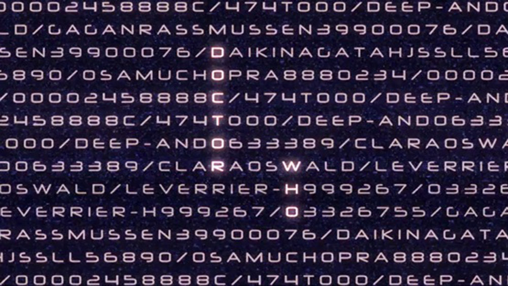
In the above interview with the ‘real die-hard fans’, Chris Chibnall delivers his verdict on the close of ‘The Trial of a Time Lord’, suggesting that it’s complicated, clichéd, and rather routine.
Yes, this will be the interview that gets pulled out each time he has The Doctor being chased down a corridor by a Dalek, but after the Moffat era of unashamedly complicated timey-wimey plots, and title sequences that are full of bluster and almost literally smoke and mirrors, it’s tempting to think that Chibnall will be minded to strip things back to basics, and have a stark, spare theme.
Although we’d like to voice our desire to see Delia Derbyshire finally get an onscreen credit alongside Ron Grainer…
Which title sequence is your favourite? Let us know below…

